Taj Catering
Brand Identity
Quantum Connect provided Taj Catering with a selection of new logo designs for a branding refresh.
We produeced three unique designs reflecting the namesake of Taj Catering, blending the crown with elements of the food service industry.
From the colour palette to the design itself, each proposal aims to pursue a distinct yet recognizable direction for Taj Catering.


Solution
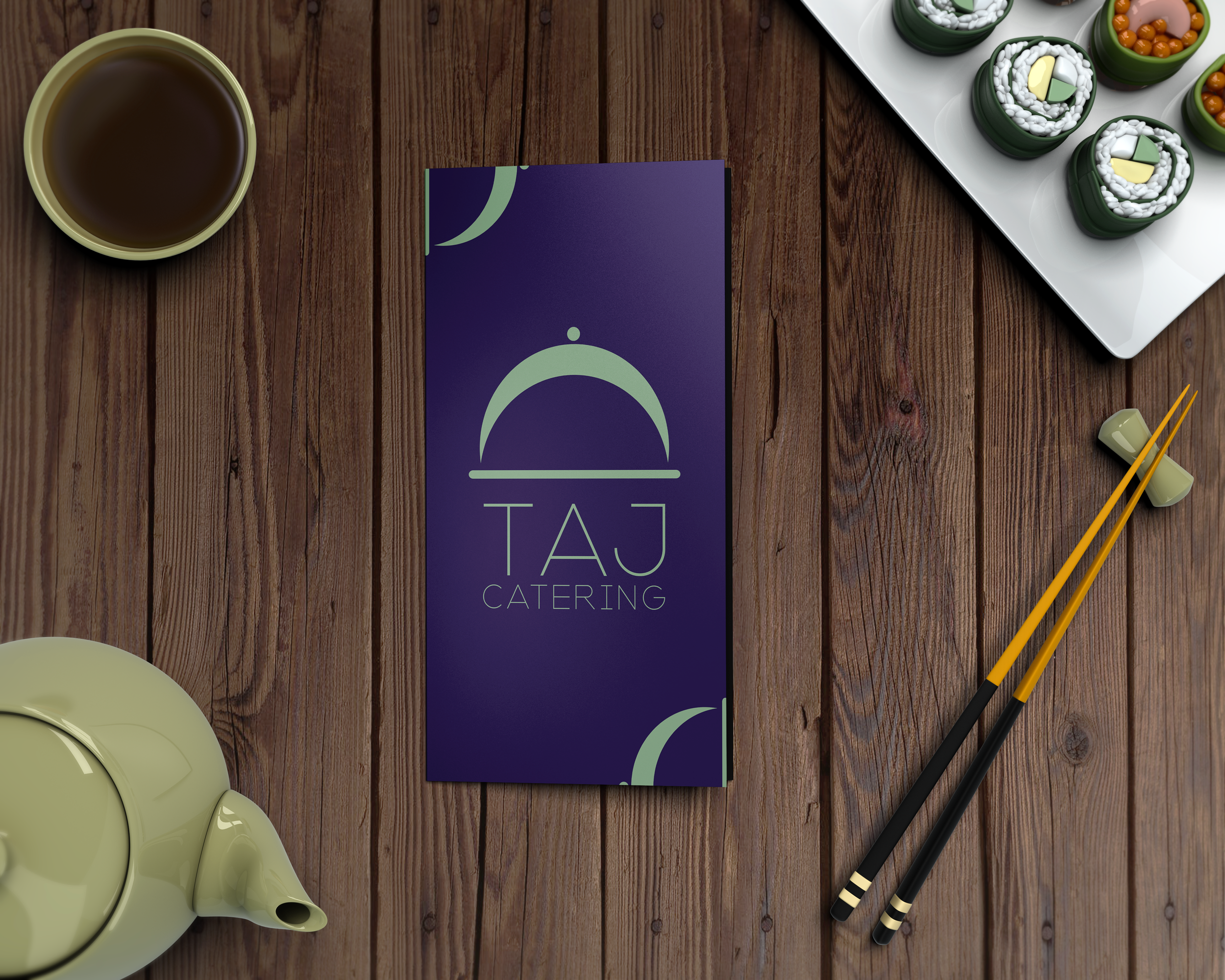
Among the three designs we produced for Taj Catering, each logo was conceived from the same ideal of blending the elements of a crown with catering.
One chosen element was the serving dish, which is commonly used in the catering industry. As the contours of the serving dish forms a semicircle, a crown design can easily be achieved after blending in elements.
The more intricate design uses two handles on each side of the dish to resemble a traditional crown. Lilac was chosen as the main colour to offset the dark Royal Purple background for this design, so as to align to the crown philosophy.
Meanwhile, the simpler design uses a similar base serving dish design, but without the handles. This design is then placed on top of the wordmark, like a crown would be worn. A light green is chosen for its high contrast against the Royal Purple background.
The third design is a more playful take on the design philosophy. By replacing the front facing element usually found on crowns with a fork, it ties into both the Crown and the Catering parts. The fork crown also is more memorable. Lavender is chosen as its main colour against the Royal Purple background.